Accessibility is the new craze in online education. A In my department, where all of our course material is delivered online (often asynchronously), course material must be extremely legible, not just to the sighted, but to the blind and viewers with limited or restricted vision. Screen readers and magnifiers help a lot, but there’s a “gray area” (fuzzy area?) where legibility is still a problem.
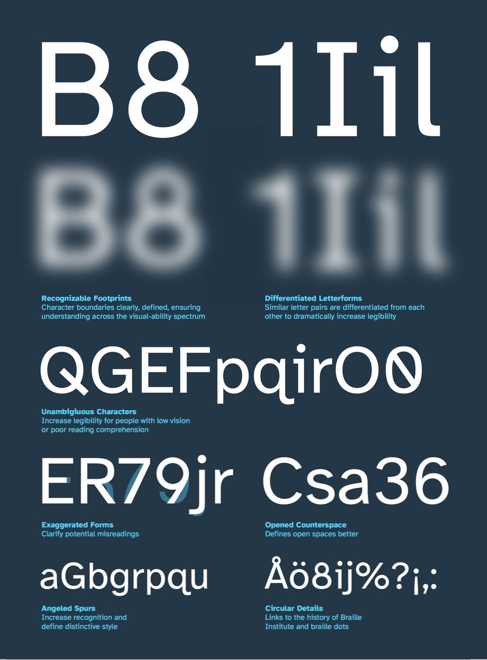
Enter the Braille Institute’s contribution, the Atkinson Hyperlegible computer font, especially designed for those of us with blurry vision. Follow the link to download your free copy, ready to install on a Mac or Windows PC. I gave it a spin yesterday with Microsoft Word, and it works like a charm, much more readable than Word’s default Arial or Calabri fonts. Even better, should you save the document as an Adobe PDF, the font carries over unchanged.

Leave a reply to therandomtexan Cancel reply